 Используя этот CSS-сниппет, Вы можете создать на своем сайте или блоге социальный виджет. Что значит социальный виджет на CSS3? Концепция следующая: есть блок и у этого блока есть переключатели, в самом блоке показываются записи с той или иной социальной сети. Ну, а переключатели, конечно, позволяют выбирать, с какой социальной сети смотреть новости. Чуть ниже этих переключателей есть кнопка, автор рассчитывал на возможность добавления социальной сети.
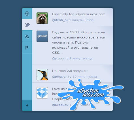
 Проверено Firefox 4, Safari 4, Chrome 13, Opera 10, IE 7 (и старше).
Код
<section class="app">
<aside class="side">
<ul class="tabs">
<li><a href="index.html"><i class="icon-dribbble"></i> Dribbble</a></li>
<li class="active"><a href="index.html"><i class="icon-twitter"></i> Twitter</a></li>
<li><a href="index.html"><i class="icon-rss"></i> RSS</a></li>
<li><a href="index.html"><i class="icon-pingver"></i> Pingver</a></li>
</ul>
<a href="index.html" class="add"><i class="icon-plus"></i> Add</a>
</aside>
<section class="main">
<article class="item">
<p>Какой браузер быстрее и надежнее: Google chrome или Opera?</p>
<footer>
<a href="index.html" class="avatar"><img src="img/pic1.png"></a>
<a href="index.html">@deab_ru</a>
<time datetime="2012-04-05T10:30:21+00:00" pubdate>4 минуты назад</time>
</footer>
</article>
<article class="item">
<p>Вид тегов CSS3: Оформлять на сайте красиво нужно все, в том числе и теги. Поэтому используйте этот вид тегов CSS...</p>
<footer>
<a href="index.html" class="avatar"><img src="img/pic2.png"></a>
<a href="index.html">@yraaa_ru</a>
<time datetime="2012-04-05T10:26:27+00:00" pubdate>8 минут назад</time>
</footer>
</article>
<article class="item">
<p>Пингвер 2.0 запущен</p>
<footer>
<a href="index.html" class="avatar"><img src="img/pic3.png"></a>
<a href="index.html">@pingver_ru</a>
<time datetime="2012-04-05T10:15:45+00:00" pubdate>15 минут назад</time>
</footer>
</article>
<article class="item">
<p>Love using Dropbox? Get your business on board! Check out Dropbox for Teams</p>
<footer>
<a href="index.html" class="avatar"><img src="img/pic4.png"></a>
<a href="index.html">@DropBox</a>
<time datetime="2012-04-05T10:14:01+00:00" pubdate>16 минут назад</time>
</footer>
</article>
</section>
</section>
Код
[class*="icon-"] {
display: block;
width: 20px;
height: 20px;
background-image: url("../img/icons.png");
background-repeat: no-repeat;
background-color: transparent;
border: 0;
color: transparent;
font: 0/0 a;
text-shadow: none;
}
.icon-twitter {
background-position: 0 0;
}
.icon-rss {
background-position: -20px 0;
}
.icon-pingver {
background-position: -40px 0;
}
.icon-dribbble {
background-position: -60px 0;
}
.icon-plus {
background-position: -80px 0;
}
.app {
position: relative;
width: 320px;
margin: 0 auto;
overflow: hidden;
background: #59afd2;
border-radius: 3px;
-webkit-box-shadow: 0 0 8px 1px rgba(0, 0, 0, 0.5);
box-shadow: 0 0 8px 1px rgba(0, 0, 0, 0.5);
}
.side {
float: left;
border-radius: 3px 0 0 3px;
}
.side a {
position: relative;
display: block;
width: 36px;
height: 38px;
background-color: transparent;
border: 0;
color: transparent;
font: 0/0 a;
text-shadow: none;
}
.side i {
cursor: pointer;
margin: -10px 0 0 -10px;
position: absolute;
top: 50%;
left: 50%;
}
.side .add {
background: #2f8aaf;
border-top: 1px solid #2a7a9b;
border-radius: 0 0 0 4px;
position: absolute;
bottom: 0px;
left: 0px;
-webkit-box-shadow: inset 0 1px rgba(255, 255, 255, 0.15);
box-shadow: inset 0 1px rgba(255, 255, 255, 0.15);
}
.side .add:hover {
background: #3497bf;
border-color: #2f8aaf;
}
.tabs {
border-bottom: 1px solid #79bedb;
border-bottom: 1px solid rgba(255, 255, 255, 0.15);
}
.tabs a {
border-top: 1px solid #79bedb;
border-top: 1px solid rgba(255, 255, 255, 0.15);
border-bottom: 1px solid #3497bf;
}
.tabs a:hover {
background: #79bedb;
}
.tabs li:first-child a {
border-top: 0;
border-radius: 4px 0 0 0;
}
.tabs .active a, .tabs a:active {
cursor: default;
z-index: 10;
background: #dee5f4;
}
.tabs .active a i, .tabs a:active i {
background-image: url("../img/icons_active.png");
}
.tabs:active .active a:not(:active) {
background: none;
}
.tabs:active .active a:not(:active) i {
background-image: url("../img/icons.png");
}
.main {
position: relative;
margin-left: 35px;
background: #dee5f4;
border-left: 1px solid #2a7a9b;
border-radius: 0 3px 3px 0;
-webkit-box-shadow: 0 0 4px rgba(0, 0, 0, 0.3);
box-shadow: 0 0 4px rgba(0, 0, 0, 0.3);
}
.item {
position: relative;
padding: 12px 15px 12px 70px;
line-height: 18px;
color: #626c80;
font-size: 11px;
text-shadow: 0 1px rgba(255, 255, 255, 0.7);
border-top: 1px solid #e9eef8;
border-bottom: 1px solid #cbd6ee;
background-color: #dee5f4;
background-image: -webkit-gradient(linear, left top, left bottom, color-stop(85%, #dee5f4), color-stop(100%, #c7d3ec));
background-image: -webkit-linear-gradient(45deg, #dee5f4 85%, #c7d3ec 100%);
background-image: -moz-linear-gradient(45deg, #dee5f4 85%, #c7d3ec 100%);
background-image: -ms-linear-gradient(45deg, #dee5f4 85%, #c7d3ec 100%);
background-image: -o-linear-gradient(45deg, #dee5f4 85%, #c7d3ec 100%);
background-image: linear-gradient(45deg, #dee5f4 85%, #c7d3ec 100%);
}
.item:first-child {
border-top: 0;
border-radius: 0 4px 0 0;
}
.item:last-child {
border-bottom: 0;
border-radius: 0 0 4px 0;
}
.item footer {
margin: 2px 0 0;
font-size: 10px;
}
.item time {
color: #92a9db;
}
.item .avatar {
display: block;
position: absolute;
top: 15px;
left: 15px;
}
.item .avatar:before {
content: '';
border: 1px solid rgba(0, 0, 0, 0.3);
border-bottom-color: rgba(0, 0, 0, 0.4);
border-radius: 3px;
position: absolute;
top: 0px;
right: 0px;
bottom: 0px;
left: 0px;
-webkit-box-shadow: inset 0 1px rgba(255, 255, 255, 0.3);
box-shadow: inset 0 1px rgba(255, 255, 255, 0.3);
}
.item .avatar img {
display: block;
width: 40px;
height: 40px;
border-radius: 3px;
}
.item:hover {
z-index: 2;
cursor: pointer;
background: #cfd9ef;
border-color: #bfcdea;
-webkit-box-shadow: inset 0 1px rgba(255, 255, 255, 0.25), 0 1px #dae2f3, 0 -1px #dee5f4;
box-shadow: inset 0 1px rgba(255, 255, 255, 0.25), 0 1px #dae2f3, 0 -1px #dee5f4;
}
.item:active, .item.selected {
z-index: 3;
cursor: auto;
background: #bfcdea;
border-color: #7e9ad4;
-webkit-box-shadow: inset 0 0 6px rgba(0, 0, 0, 0.3), 0 1px #dee5f4, 0 -1px #dee5f4;
box-shadow: inset 0 0 6px rgba(0, 0, 0, 0.3), 0 1px #dee5f4, 0 -1px #dee5f4;
}
.lt-ie8 .side a {
vertical-align: top;
}
.lt-ie8 .main {
margin: 0 35px 0 0;
left: 35px;
}
.side a, .item {
-webkit-transition: background 0.15s;
-moz-transition: background 0.15s;
-ms-transition: background 0.15s;
-o-transition: background 0.15s;
transition: background 0.15s;
}
display: block;
width: 20px;
height: 20px;
background-image: url("../img/icons.png");
background-repeat: no-repeat;
background-color: transparent;
border: 0;
color: transparent;
font: 0/0 a;
text-shadow: none;
}
.icon-twitter {
background-position: 0 0;
}
.icon-rss {
background-position: -20px 0;
}
.icon-pingver {
background-position: -40px 0;
}
.icon-dribbble {
background-position: -60px 0;
}
.icon-plus {
background-position: -80px 0;
}
.app {
position: relative;
width: 320px;
margin: 0 auto;
overflow: hidden;
background: #59afd2;
border-radius: 3px;
-webkit-box-shadow: 0 0 8px 1px rgba(0, 0, 0, 0.5);
box-shadow: 0 0 8px 1px rgba(0, 0, 0, 0.5);
}
.side {
float: left;
border-radius: 3px 0 0 3px;
}
.side a {
position: relative;
display: block;
width: 36px;
height: 38px;
background-color: transparent;
border: 0;
color: transparent;
font: 0/0 a;
text-shadow: none;
}
.side i {
cursor: pointer;
margin: -10px 0 0 -10px;
position: absolute;
top: 50%;
left: 50%;
}
.side .add {
background: #2f8aaf;
border-top: 1px solid #2a7a9b;
border-radius: 0 0 0 4px;
position: absolute;
bottom: 0px;
left: 0px;
-webkit-box-shadow: inset 0 1px rgba(255, 255, 255, 0.15);
box-shadow: inset 0 1px rgba(255, 255, 255, 0.15);
}
.side .add:hover {
background: #3497bf;
border-color: #2f8aaf;
}
.tabs {
border-bottom: 1px solid #79bedb;
border-bottom: 1px solid rgba(255, 255, 255, 0.15);
}
.tabs a {
border-top: 1px solid #79bedb;
border-top: 1px solid rgba(255, 255, 255, 0.15);
border-bottom: 1px solid #3497bf;
}
.tabs a:hover {
background: #79bedb;
}
.tabs li:first-child a {
border-top: 0;
border-radius: 4px 0 0 0;
}
.tabs .active a, .tabs a:active {
cursor: default;
z-index: 10;
background: #dee5f4;
}
.tabs .active a i, .tabs a:active i {
background-image: url("../img/icons_active.png");
}
.tabs:active .active a:not(:active) {
background: none;
}
.tabs:active .active a:not(:active) i {
background-image: url("../img/icons.png");
}
.main {
position: relative;
margin-left: 35px;
background: #dee5f4;
border-left: 1px solid #2a7a9b;
border-radius: 0 3px 3px 0;
-webkit-box-shadow: 0 0 4px rgba(0, 0, 0, 0.3);
box-shadow: 0 0 4px rgba(0, 0, 0, 0.3);
}
.item {
position: relative;
padding: 12px 15px 12px 70px;
line-height: 18px;
color: #626c80;
font-size: 11px;
text-shadow: 0 1px rgba(255, 255, 255, 0.7);
border-top: 1px solid #e9eef8;
border-bottom: 1px solid #cbd6ee;
background-color: #dee5f4;
background-image: -webkit-gradient(linear, left top, left bottom, color-stop(85%, #dee5f4), color-stop(100%, #c7d3ec));
background-image: -webkit-linear-gradient(45deg, #dee5f4 85%, #c7d3ec 100%);
background-image: -moz-linear-gradient(45deg, #dee5f4 85%, #c7d3ec 100%);
background-image: -ms-linear-gradient(45deg, #dee5f4 85%, #c7d3ec 100%);
background-image: -o-linear-gradient(45deg, #dee5f4 85%, #c7d3ec 100%);
background-image: linear-gradient(45deg, #dee5f4 85%, #c7d3ec 100%);
}
.item:first-child {
border-top: 0;
border-radius: 0 4px 0 0;
}
.item:last-child {
border-bottom: 0;
border-radius: 0 0 4px 0;
}
.item footer {
margin: 2px 0 0;
font-size: 10px;
}
.item time {
color: #92a9db;
}
.item .avatar {
display: block;
position: absolute;
top: 15px;
left: 15px;
}
.item .avatar:before {
content: '';
border: 1px solid rgba(0, 0, 0, 0.3);
border-bottom-color: rgba(0, 0, 0, 0.4);
border-radius: 3px;
position: absolute;
top: 0px;
right: 0px;
bottom: 0px;
left: 0px;
-webkit-box-shadow: inset 0 1px rgba(255, 255, 255, 0.3);
box-shadow: inset 0 1px rgba(255, 255, 255, 0.3);
}
.item .avatar img {
display: block;
width: 40px;
height: 40px;
border-radius: 3px;
}
.item:hover {
z-index: 2;
cursor: pointer;
background: #cfd9ef;
border-color: #bfcdea;
-webkit-box-shadow: inset 0 1px rgba(255, 255, 255, 0.25), 0 1px #dae2f3, 0 -1px #dee5f4;
box-shadow: inset 0 1px rgba(255, 255, 255, 0.25), 0 1px #dae2f3, 0 -1px #dee5f4;
}
.item:active, .item.selected {
z-index: 3;
cursor: auto;
background: #bfcdea;
border-color: #7e9ad4;
-webkit-box-shadow: inset 0 0 6px rgba(0, 0, 0, 0.3), 0 1px #dee5f4, 0 -1px #dee5f4;
box-shadow: inset 0 0 6px rgba(0, 0, 0, 0.3), 0 1px #dee5f4, 0 -1px #dee5f4;
}
.lt-ie8 .side a {
vertical-align: top;
}
.lt-ie8 .main {
margin: 0 35px 0 0;
left: 35px;
}
.side a, .item {
-webkit-transition: background 0.15s;
-moz-transition: background 0.15s;
-ms-transition: background 0.15s;
-o-transition: background 0.15s;
transition: background 0.15s;
}
Рейтинг: 0.0/0
